
The NOAA GML Carbon Cycle Interactive Atmospheric Data Visualization (IADV) Web site provides graphs of GML data, including our most up-to-date measurements, to the scientific community, as well as the general public, educators, students, the press, business and government policymakers.
Visitors may
Data are freely available directly from the GML FTP Server Before actual data are made available, they must undergo critical evaluation. Evaluation procedures ensure that (1) any standard reference gases used in making the measurements in Boulder and in the field are well characterized (i.e., calibrated before and after their use); (2) measurements compromised during collection or analysis are identified, and (3) valid measurements not representative of typical background conditions are identified. Quality control of the data requires considerable time and effort and is an essential part of GML operations.
Warning: Preliminary data include GML's most up-to-date data and have not yet been subjected to rigorous quality assurance procedures. Preliminary data viewed from this site are sometimes "pre-filtered" using tools designed to identify suspect values. Filtering is performed each time a data set containing preliminary data is requested. Filtering, however, cannot identify systematic experimental errors and will not be used in place of existing data assurance procedures. Thus, there exists the potential to make available preliminary data with systematic biases. In all graphs, preliminary data are clearly identified. Users are strongly encouraged to contact the appropriate program chief before attempting to interpret preliminary data.
The IADV home page displays an interactive map showing GML sampling locations (Figure 1). Position the mouse over a marker to view additional information about the site. Depending on the setting of the 'Popup Detail' selection box, this information could be either the site name ('Brief'), a summary of available measurements from the site ('Full') or nothing at all. The Popup detail is set by selecting an option in the select box located on the bar above the map.
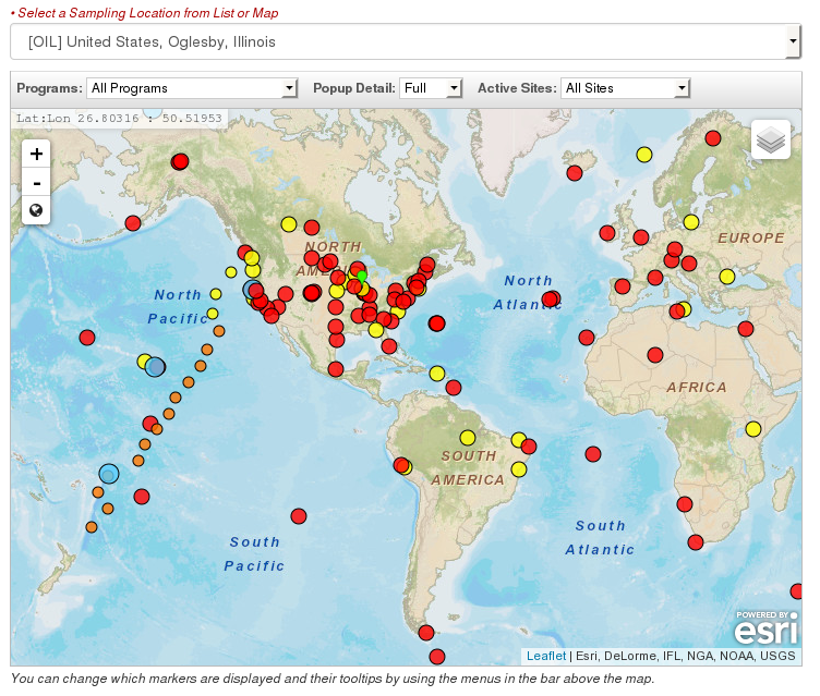
There are controls allowing you to zoom in and out.
You can choose different map styles, 'Map' or 'Satellite', with 'Terrain' from the  image.
There is also a pulldown list of sites above the map, which can be used to select the site of interest.
Select a sampling location in one of two ways:
The user's current selection is shown to the right of the map (Figure 2). By default, the IADV home page sets the current selection to Mauna Loa, Hawaii. Please note: The pulldown list in the bar above the map will show the currently selected location.
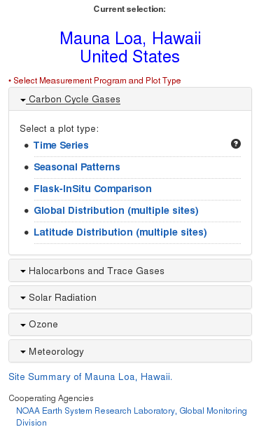
By clicking on the title of one of the programs, a list of plot types will slide down into view. You can then click on one of the links to be taken to a new page with the selected plot. More options for modifying the selected plot are available on the new page. The "Site Summary of ..." link will take you to another page with additional information for the selected site.
After clicking on a plot type link, you are taken to a page showing the desired plot type, along with options for changing some of the parameters of the plot. The number of options will depend on the plot type selected. Figure 3 shows an example of a time series plot.
Additional plot types are shown on the left side. Click on the name of the plot type, and options for that type and a submit button will become visible. Choose your options and click on the 'Submit' button to view that plot.
Time Series plot types will show a button
 to save the dataset in the plot.
By clicking on this button, information about the dataset that is in the plot will be saved, which can be
used later for making custom plots. Clicking on the 'View Saved Datasets' link from the IADV menu
to save the dataset in the plot.
By clicking on this button, information about the dataset that is in the plot will be saved, which can be
used later for making custom plots. Clicking on the 'View Saved Datasets' link from the IADV menu  will
show the dataset information that has been saved so far.
will
show the dataset information that has been saved so far.
To access the custom plot page, click on the 'Custom Plots' link from the IADV menu button .
You will be taken to a new web page where you can edit
the saved datasets, and specify those datasets that are to be plotted (Figure 4).
The Custom Plots page is used to create custom graphs from saved datasets. These custom plots can overlay
multiple datasets on one graph frame, and also include multi-panel graphs.
Custom plots of saved datasets are currently available only for time series data. This option allows the user to create graphs with a specified X-axis, Y-axis, and data sets in one to five frames.
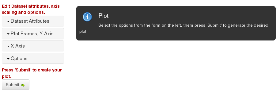
Edit Datasets and their plot attributes
The first section shows a list of the saved datasets. Options in this section are to remove a dataset from the list, and to modify the plot attributes of a dataset, such as marker symbol and color.
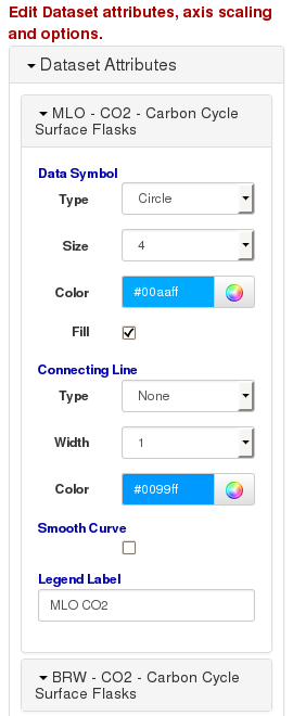
Click on the dataset name to view the plot attributes and legend label for a data set. You can modify the
marker type, size, and color; the line connecting the data points, and the label for the dataset that appears
in the legend of the plot. You can click on the name of another dataset at any time.
Click on the 'x' symbol  to remove a dataset from the list.
Select datasets, Y axis scaling and title for each plot frame
The Plot Frames, Y Axis section is used to select which data sets will be shown in a plot frame. Click on the 'Plot Frames, Y axis' section to view the available options. Up to 5 plot frames can be shown on the plot, and any number of datasets can be shown in each frame.
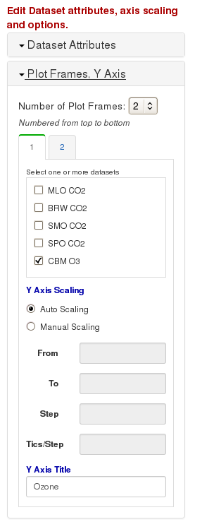
Select the number of plot frames you want to use. For each frame, check the boxes next to the dataset that you want to plot in that frame. Make sure you select at least one dataset for each frame.
For each frame, you can also specify the scaling of the Y axis. You can choose either Auto scaling, or specify the range manually. Specify the minimum and maximum values for the axis, the step size where axis labels will go, and the number of minor ticks that will be drawn between each step.
Select X Axis Scaling and Title
The X Axis section is used to set the time range of the frames in the plot.
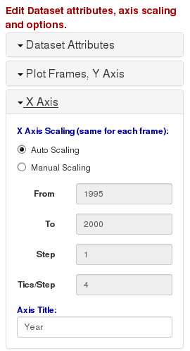
All frames in the plot will have the same X axis scale. You can choose either Auto scaling, or specify the range manually. Specify the minimum and maximum values for the axis, the step size where axis labels will go, and the number of minor ticks that will be drawn between each step.
Select Options
The Options section is used to set additional options for the plot, such as showing grids and legends, and adjusting the size and color of the plot page.
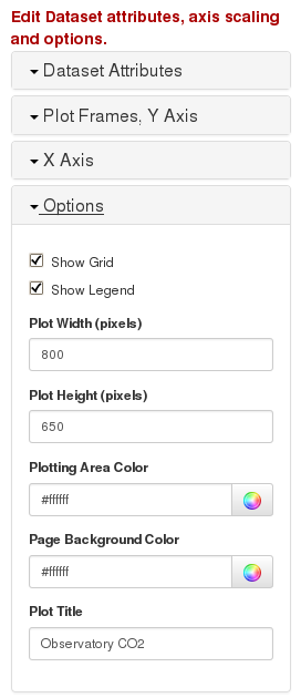
Enter values into the text boxes for the options. For the width and height of the plot, enter an integer value
in pixels (approximately 100 pixels per inch). For colors, enter a valid hexadecimal rgb code, (e.g. "#ff0000",
is red) or select a color by clicking on the color icon  .
You can also add text to be displayed at the top of the plot for the title.
.
You can also add text to be displayed at the top of the plot for the title.
Press 'Submit' button to create your plot.
The last section just has a button for creation of the plot. Once the 'Submit' button is pressed, the desired plot will be created and shown to the right or below the options form. This may take several moments to create. A PDF copy of the custom plot is also made, and can be seen by clicking on the 'PDF Version' link.
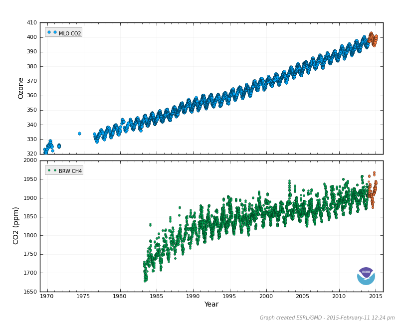
Here is an example of a custom plot, two frames, each with one dataset. The top frame show CO2 data from Mauna Loa, Hawaii, and the bottom frame shows CH4 data from Barrow, Alaska.
Request for Feedback
We welcome your suggestions and comments regarding this site. Please e-mail your comments to Kirk Thoning (kirk.thoning@noaa.gov). If the site does not appear to be operating correctly, include in your e-mail the name and version of the browser, operating system, and a complete description of problem.