|
Information
Results
Get Involved
Resources
|
|
|
|
Here we provide
a detailed description and an example of what is available.
|
|
CO2 Weather - US (Example)
|

|
|
The column average CO2 mole fraction calculated in CarbonTracker for the time period indicated. Blue colors indicate regions where CO2 in the atmosphere is relatively low, whereas red colors indicate high CO2 abundances. Plumes of CO2 move with the weather systems across the continent and illustrate the dynamic nature of our atmosphere. Because NOAA ESRL measurements were used to optimize the surface exchange of CO2, the distribution shown is optimally consistent with our actual measurements of CO2. Units are parts per million of CO2. The column average mole fraction is weighted by the mass of air at each altitude between the surface and 10 hPa (the top of the model domain) and represents an instantaneous sample at the time specified for each 1x1 degree gridbox.
Click here to see CarbonTracker CO2 Weather Movies.
|
|
|
CO2 Weather - Global (Example)
|

|
|
The column average CO2 mole fraction calculated in CarbonTracker for the time period indicated. Blue colors indicate regions where CO2 in the atmosphere is relatively low, whereas red colors indicate high CO2 abundances. Plumes of CO2 move with the weather systems across the continent and illustrate the dynamic nature of our atmosphere. Because NOAA ESRL measurements were used to optimize the surface exchange of CO2, the distribution shown is optimally consistent with our actual measurements of CO2. Units are parts per million of CO2. The column average mole fraction is weighted by the mass of air at each altitude between the surface and 10 hPa (the top of the model domain) and represents an instantaneous sample at the time specified for each 1x1 degree gridbox.
Click here to see CarbonTracker CO2 Weather Movies.
|
|
|
Flux Maps - US (Example)
|
 ";
";

|
|
Left Panel: The pattern of CO2 exchange calculated in CarbonTracker for the time period indicated. Negative fluxes (blue regions) indicate places where uptake of CO2 occurs. Positive fluxes (red colors) indicate places where emission of CO2 occurs. The pattern of exchange follows swings in temperature and sunlight and changes with season. Units are gC/m2/yr. The figures include biological and fire fluxes, no fossil fuels.
Right Panel: The uncertainty on the estimated fluxes. All estimates started with 80% uncertainty on the land parameters, and 40% on the ocean parameters. Reduction of uncertainty occurs when observations inform us on the carbon cycle and limit the possible flux strength to less than we originally prescribed. Dark red areas show relatively large uncertainty, blue is relatively little. All uncertainties indicate a one-sigma standard deviation on the fluxes estimated assuming Gaussian errors. In the monthly and annual averages, we show the RMS uncertainty while temporal covariances are ignored. Units are gC/m2/yr. Uncertainties reported here are formal estimates from the inversion technique and do not include all sources of error. Flux uncertainties are among the most difficult quantities to compute, and care should be taken in their interpretation.
Results Summary: The table summarizes averages with uncertainty of the data displayed in the figure. The fossil and fire emissions are prescribed in CarbonTracker; the estimated mean includes ocean and terrestrial fluxes calculated by CarbonTracker. The total flux is the sum of the components in the table. Note that fossil fuel emissions can occur over regions characterized as ocean. This is partly due to real emissions from international shipping, and partly due to emissions occurring in coastal land regions that are assigned to the ocean in our coarse 1x1 degree division scheme. The same is true for fossil fuel emissions over non-optimized regions such as ice, polar deserts, and inland seas.
|
Results Summary (all units PgC/yr) [EXAMPLE ONLY - not accurate values]| Region Name | Estimated Mean | Fossil Emissions | Fire Emissions | Total Flux | | Total North America | -8.34 ± 1.26 | 1.76 | 0.05 | -6.53
± 1.26 | | Boreal North America | -3.43 ± 0.62 | 0.01 | 0.00 | -3.41
± 0.62 | | Temperate North America | -4.91 ± 1.05 | 1.75 | 0.04 | -3.12
± 1.05 |
|
|
|
Flux Maps - Global (Example)
|

|

|
|
Left Panel: The pattern of CO2 exchange calculated in CarbonTracker for the time period indicated. Negative fluxes (blue regions) indicate places where uptake of CO2 occurs. Positive fluxes (red colors) indicate places where emission of CO2 occurs. The pattern of exchange follows swings in temperature and sunlight and changes with season. Note that the two hemispheres often have opposite colors as the seasons are juxtaposed. Units are gC/m2/yr. The figures include biological and fire fluxes, no fossil fuels.
Right Panel: The uncertainty on the estimated fluxes. All estimates started with 80% uncertainty on the land parameters, and 40% on the ocean parameters. Reduction of uncertainty occurs when observations inform us on the carbon cycle and limit the possible flux strength to less than we originally prescribed. Dark red areas show relatively large uncertainty, blue is relatively little. All uncertainties indicate a one-sigma standard deviation on the fluxes estimated assuming Gaussian errors. Note that spatial covariances, which by design are very large in the tropics, are not displayed on this map giving the false impression of lowest uncertainty in these regions. In the monthly and annual averages, we show the RMS uncertainty while temporal covariances are ignored. Units are gC/m2/yr. Uncertainties reported here are formal estimates from the inversion technique and do not include all sources of error. Flux uncertainties are among the most difficult quantities to compute, and care should be taken in their interpretation.
Results Summary: The table summarizes averages with uncertainty of the data displayed in the figure. The fossil and fire emissions are prescribed in CarbonTracker; the estimated mean includes ocean and terrestrial fluxes calculated by CarbonTracker. The total flux is the sum of the components in the table. Note that fossil fuel emissions can occur over regions characterized as ocean. This is partly due to real emissions from international shipping, and partly due to emissions occurring in coastal land regions that are assigned to the ocean in our coarse 1x1 degree division scheme. The same is true for fossil fuel emissions over non-optimized regions such as ice, polar deserts, and inland seas.
|
Results Summary (all units PgC/yr) [EXAMPLE ONLY - not accurate values]| Region Name | Estimated Mean | Fossil Emissions | Fire Emissions | Total Flux | | Total Flux | -22.98 ± 2.61 | 6.83 | 4.06 | -12.09
± 2.61 | | Land Flux | -21.60 ± 2.52 | 6.31 | 4.03 | -11.26
± 2.52 | | Ocean Flux | -1.22 ± 0.51 | 0.59 | 0.03 | -0.60
± 0.51 |
|
|
|
Flux Maps - Ocean (Example)
|

|

|
|
Left Panel: The pattern of CO2 exchange calculated in CarbonTracker for the time period indicated. Negative fluxes (blue regions) indicate places where uptake of CO2 occurs. Positive fluxes (red colors) indicate places where emission of CO2 occurs. The pattern of exchange follows swings in temperature and sunlight and changes with season. Note that the two hemispheres often have opposite colors as the seasons are juxtaposed. Units are gC/m2/yr. The figures include biological and fire fluxes, no fossil fuels.
Right Panel: The uncertainty on the estimated fluxes. All estimates started with 80% uncertainty on the land parameters, and 40% on the ocean parameters. Reduction of uncertainty occurs when observations inform us on the carbon cycle and limit the possible flux strength to less than we originally prescribed. Dark red areas show relatively large uncertainty, blue is relatively little. All uncertainties indicate a one-sigma standard deviation on the fluxes estimated assuming Gaussian errors. In the monthly and annual averages, we show the RMS uncertainty while temporal covariances are ignored. Units are gC/m2/yr. Uncertainties reported here are formal estimates from the inversion technique and do not include all sources of error. Flux uncertainties are among the most difficult quantities to compute, and care should be taken in their interpretation.
Results Summary: The table summarizes averages with uncertainty of the data displayed in the figure. The fossil and fire emissions are prescribed in CarbonTracker; the estimated mean includes ocean and terrestrial fluxes calculated by CarbonTracker. The total flux is the sum of the components in the table. Note that fossil fuel emissions can occur over regions characterized as ocean. This is partly due to real emissions from international shipping, and partly due to emissions occurring in coastal land regions that are assigned to the ocean in our coarse 1x1 degree division scheme. The same is true for fossil fuel emissions over non-optimized regions such as ice, polar deserts, and inland seas.
|
Results Summary (all units PgC/yr) [EXAMPLE ONLY - not accurate values]| Region Name | Estimated Mean | Fossil Emissions | Fire Emissions | Total Flux | | Total Flux | -22.98 ± 2.61 | 6.83 | 4.06 | -12.09
± 2.61 | | Land Flux | -21.60 ± 2.52 | 6.31 | 4.03 | -11.26
± 2.52 | | Ocean Flux | -1.22 ± 0.51 | 0.59 | 0.03 | -0.60
± 0.51 |
|
|
|
Flux Time Series (Example)
|

|
Results Summary (all units PgC/yr) [EXAMPLE ONLY - not accurate values]| Year | First Guess | Estimate | Fire Emission | Fossil Emission | Total Flux | | 2000 | -0.11 ± 0.93 | -0.57 ± 0.65 | 0.03 | 1.70 | 1.17
± 0.65 | | 2001 | -0.17 ± 0.90 | -0.42 ± 0.69 | 0.02 | 1.76 | 1.36
± 0.69 | | 2002 | 0.04 ± 0.87 | -0.35 ± 0.61 | 0.03 | 1.82 | 1.49
± 0.61 | | 2003 | -0.22 ± 0.87 | -0.54 ± 0.62 | 0.03 | 1.86 | 1.35
± 0.62 | | 2004 | -0.19 ± 0.90 | -0.68 ± 0.51 | 0.02 | 1.90 | 1.24
± 0.51 | | 2005 | -0.14 ± 0.88 | -0.61 ± 0.55 | 0.03 | 1.91 | 1.32
± 0.55 |
|
|
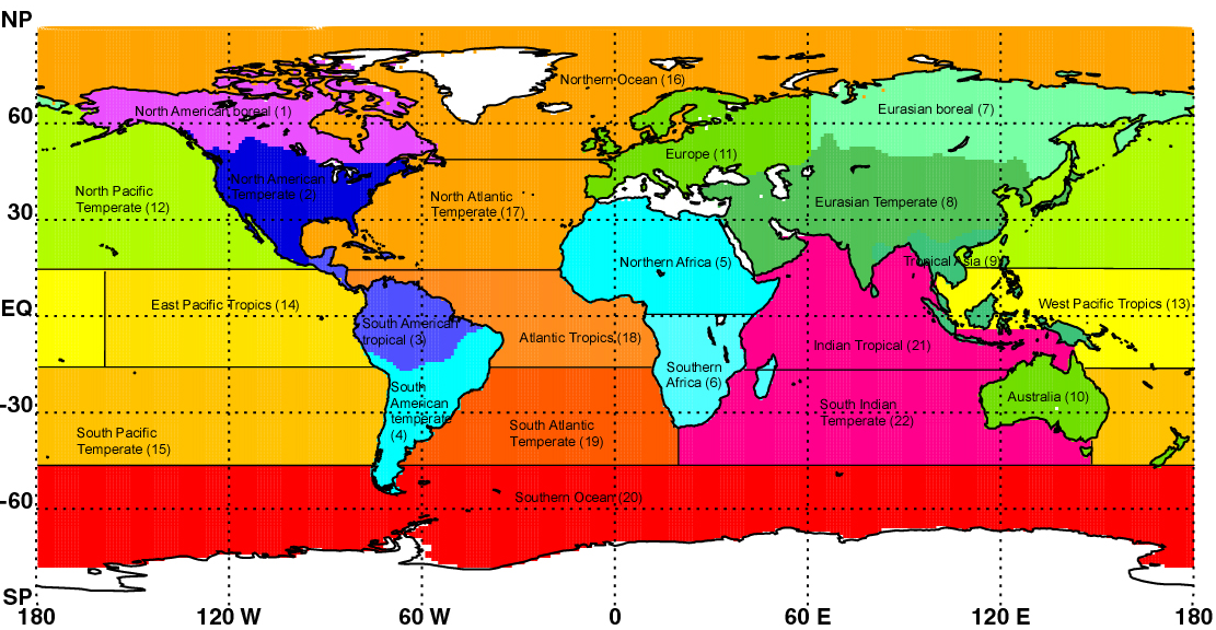
Time series of the exchange calculated with CarbonTracker aggregated over larger areas of the globe. The title reflects areas defined in the TransCom project and can be found on this map. The blue line is the final result from CarbonTracker on a weekly time scale, the red line is 4-week moving average, the dark shaded band is the one-sigma uncertainty after the assimilation. All units are PgC/yr. The red line is a 4-week running average of the weekly CarbonTracker estimate introduced to remove the short-term variability in our a-priori guess. The shaded areas denote one-sigma (68% confidence) intervals calculated from the posterior covariance matrixes, disregarding its temporal structure. This figure includes biological and fire fluxes, no fossil fuels.
The table summarizes averages with uncertainty of the data displayed in the figure. The total flux is the sum of the components in the table. Note that fossil fuel emissions can occur over regions characterized as ocean. This is partly due to real emissions from international shipping, and partly due to emissions occurring in coastal land regions that are assigned to the ocean in our coarse 1x1 degree division scheme. The same is true for fossil fuel emissions over non-optimized regions such as ice, polar deserts, and inland seas.
|
|
|
Product Evaluation - Time Series Comparison (Example)
|

|
|
Time series of CO2 mole fractions at a CarbonTracker observation
site. In the top panel, measured mole fractions (open black circles)
are plotted along with CarbonTracker simulated values (light blue
open circles). At some sites, there are observations that
CarbonTracker can not simulate successfully; these are shown as
filled red circles. The bottom panel shows a time series of
residuals--the difference between the simulated and measured mole
fractions--shown with dark blue open circles. These residuals should
be uncorrelated in time, unbiased (i.e., have a mean of zero), and
distributed normally. Also shown in the lower panel is the imposed
model-data mismatch ("MDM", orange bars), which in part defines the
rejection criterion (see documentation).
Any model first guess value which is more than
three times the MDM away from zero, after accounting for potential
adjustments to the simulated value due to optimizing fluxes, is
rejected by the optimization system. Rejected values, if there are
any, are shown with filled red circles.
|

|
|
Seasonal histograms of the residuals at this site. See caption for
top figure for the definition of residuals. The left panel collects
all residuals for each northern hemisphere summer (June through
September); the right panel is the northern hemisphere winter
(November through April). Residuals before 1 Jan 2001 are excluded
from this analysis to avoid an effect of CarbonTracker burn-in from a
poorly-known initial CO2 distribution.
The tan color shows
the histogram of the residuals themselves; the blue lines and
statistics shown in blue text are a summary of the residuals
interpreted as a normal distribution. The assumed model-data mismatch
is shown in green (lines and text). The vertical scales are relative,
determined by the number of observations and how tightly they are
grouped, with the area under the histogram forced to unity.
|
|
|
