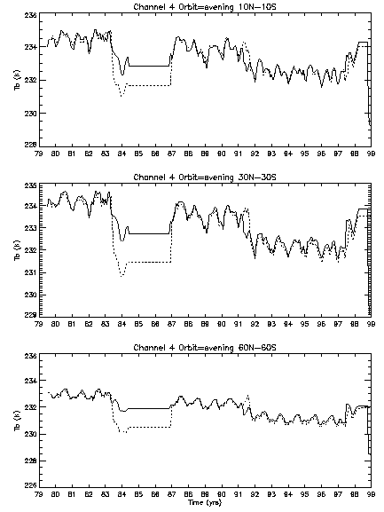
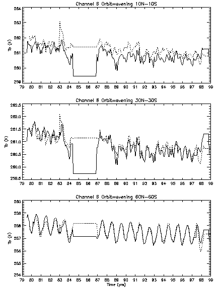
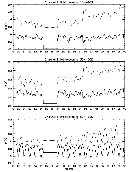
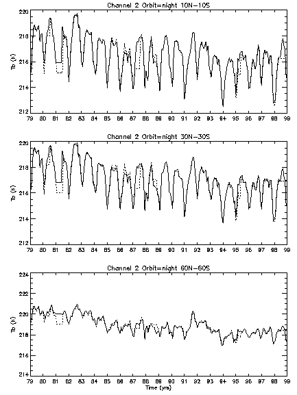
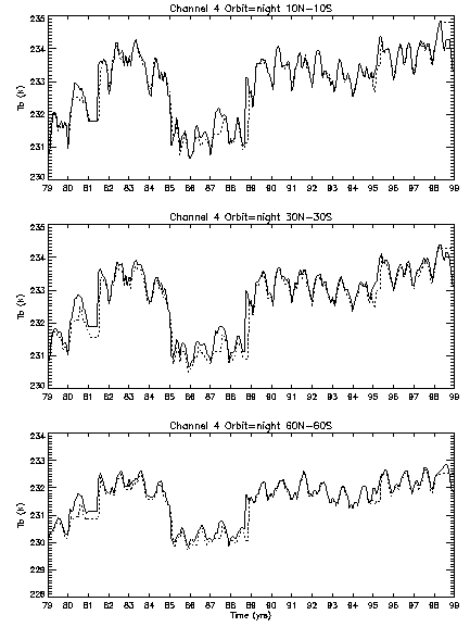
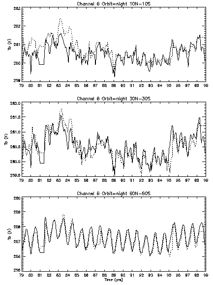
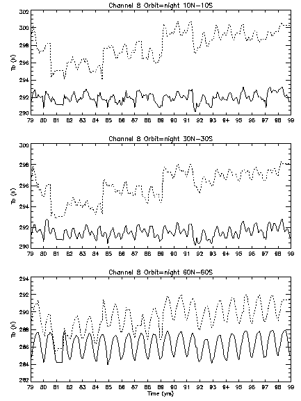
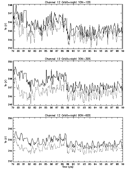
NESDIS Sounding Comparison
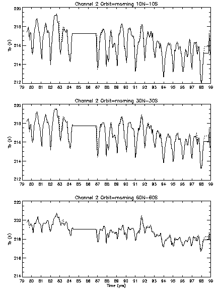
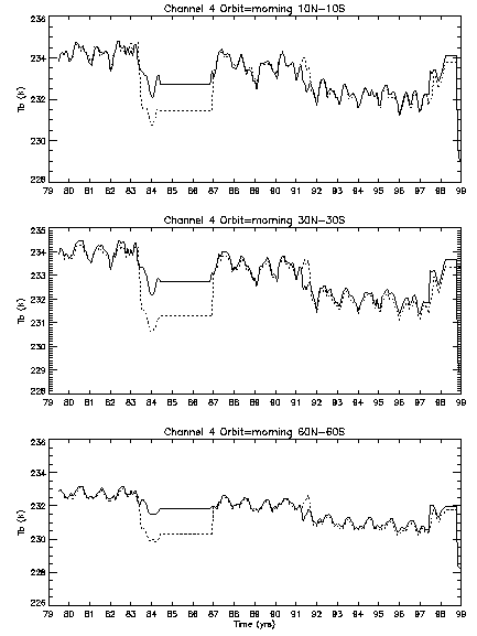
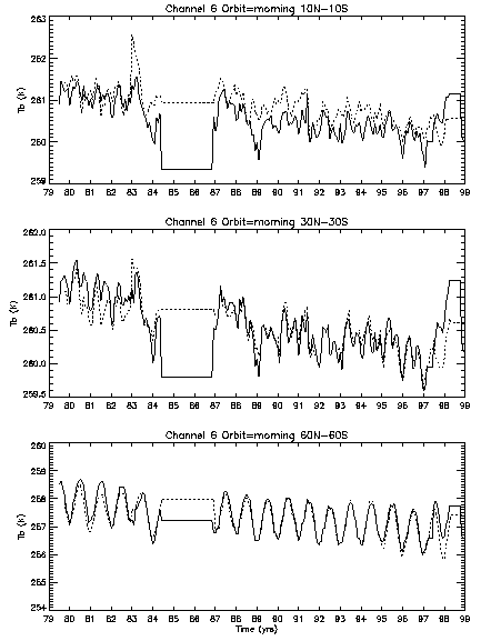
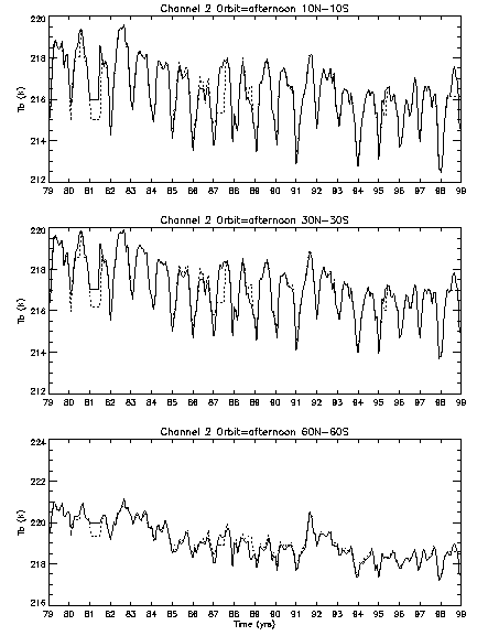
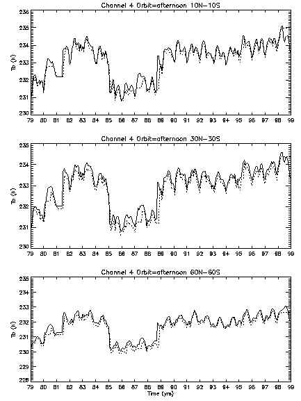
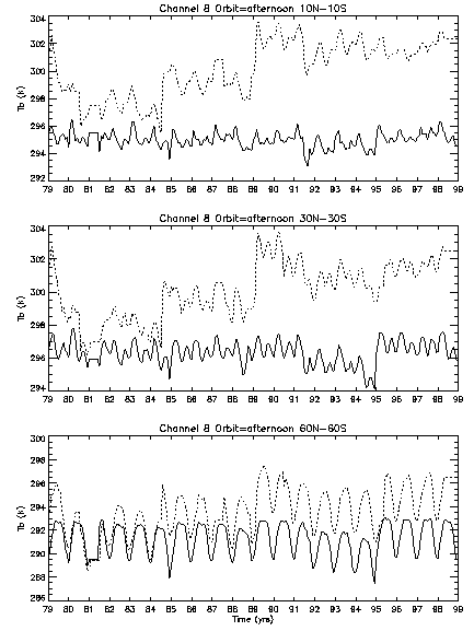
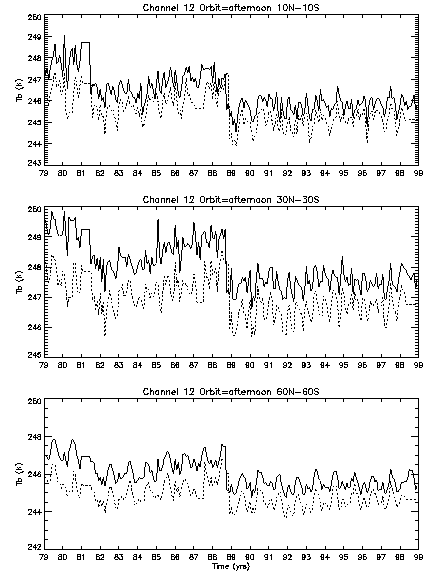
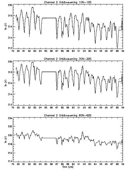
I first begin with comparing the original monthly mean
brightness temperature data before any EDF or mean bias
correction adjustments have been applied to either data set.
The table below compares zonally averaged data from Pathfinder
and NESDIS sounding data for several channels and for each
satellite pass. Solid line indicates Pathfinder results, dotted
line are the NESDIS results.
Comparison of monthly grids of NESDIS and Pathfinder data
provide information about how regional biases affect the zonal
mean biases seen above.
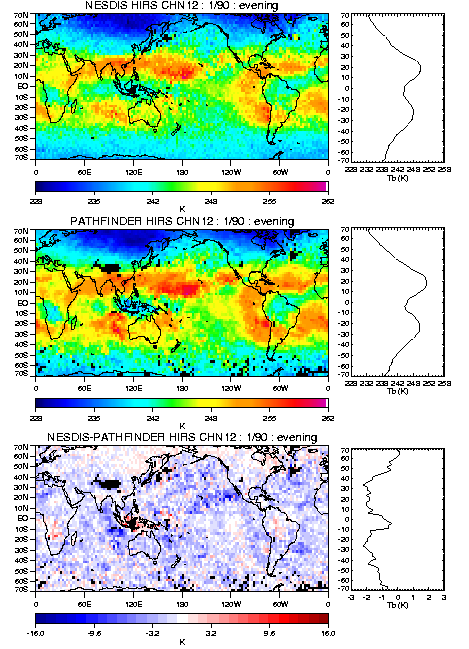
A comparison of the HIRS Pathfinder clear-sky data and the
NESDIS Sounding clear-sky data was accomplished for channels 4,
6 and 12. All comparisons are using clear-sky data that have
been adjusted using EDFs. The first comparison looks at the
monthly climatology maps for each date set for January and July.
The climatology for the Pathfinder data is based on data for the
period 1/79-12/99 while the NESDIS sounding data period is
3/79-5/98.
Channel 4 January Climatology
Channel 6 January Climatology
Channel 12 January Climatology
Channel 4 July Climatology
Channel 6 July Climatology
Channel 12 July Climatology
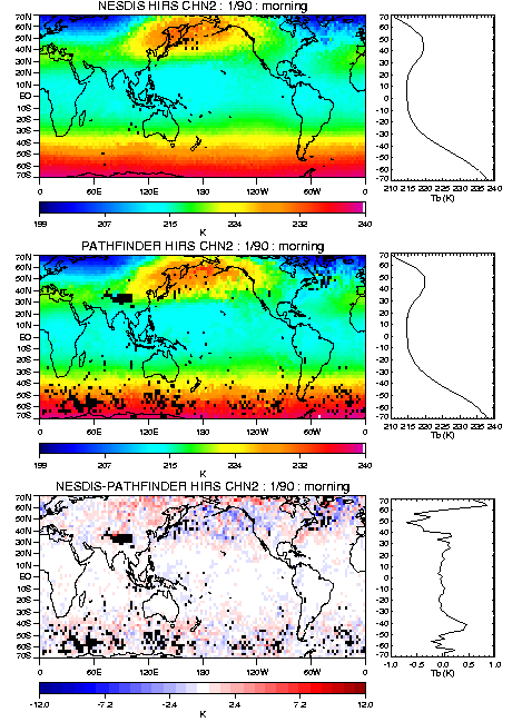
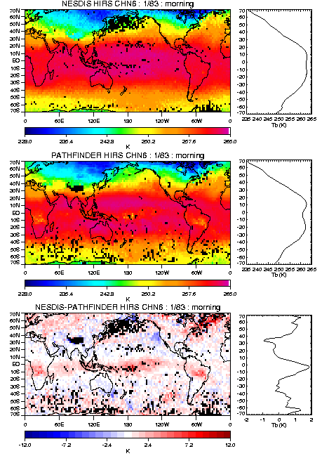
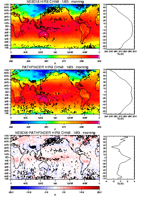
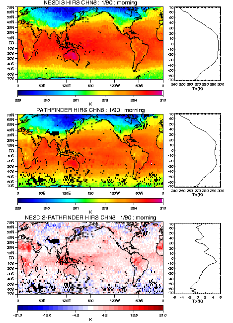
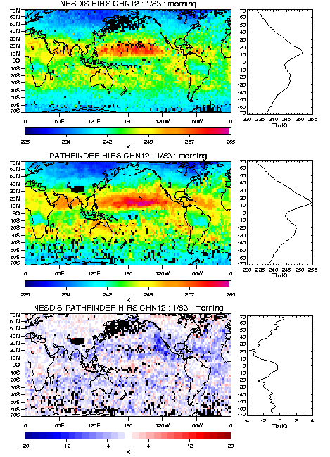
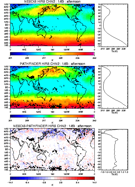
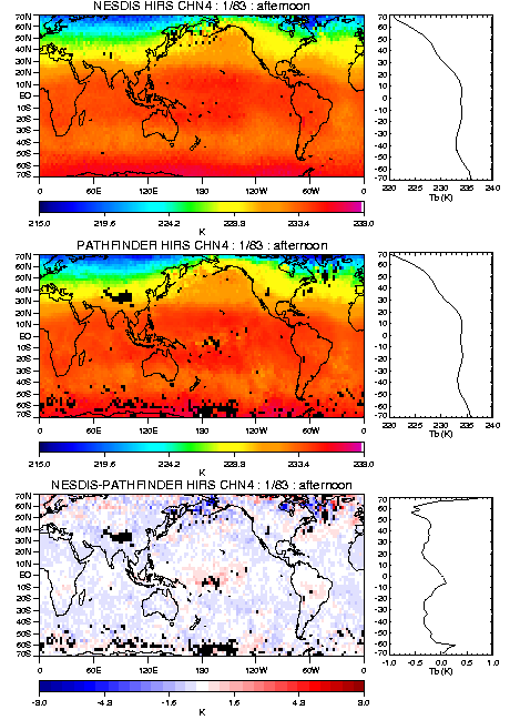
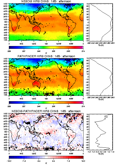
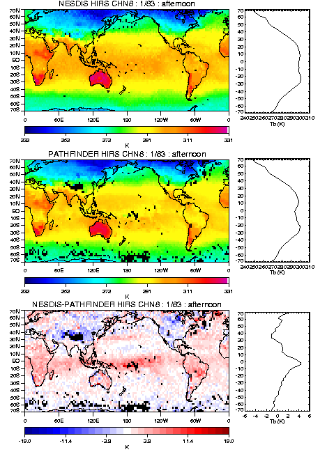
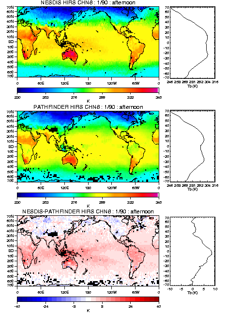
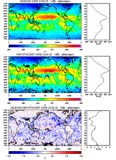
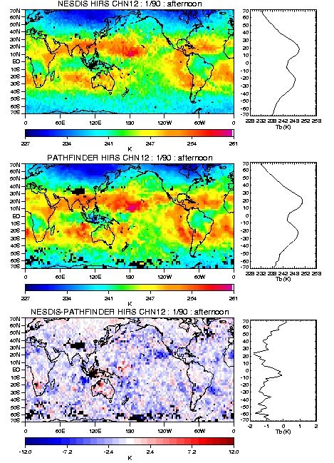
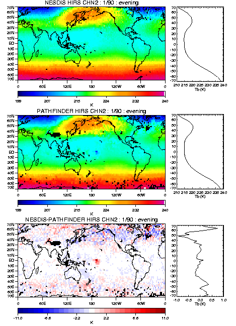
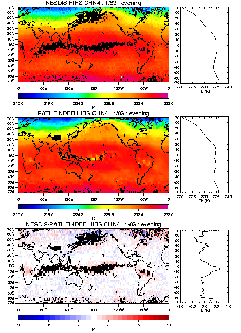
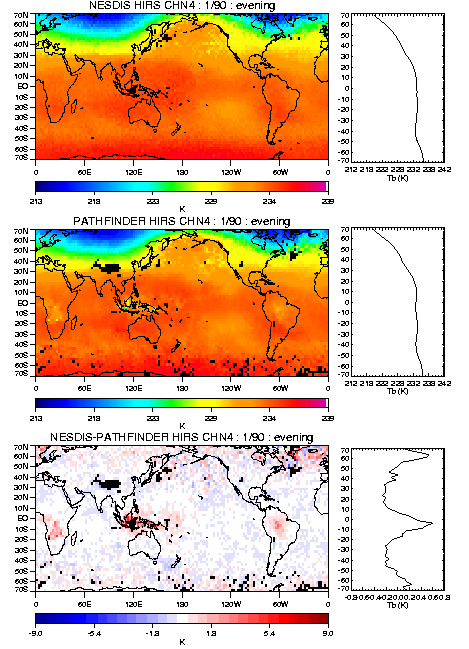
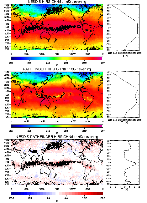
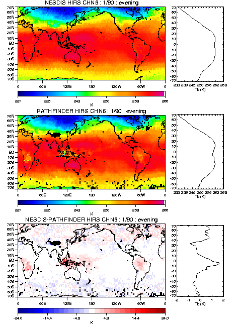
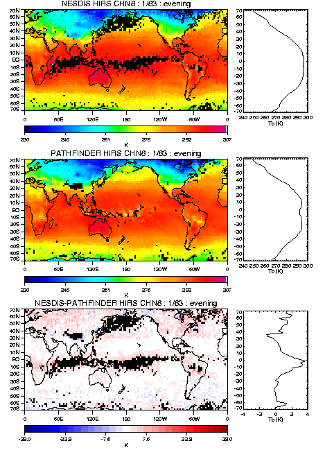
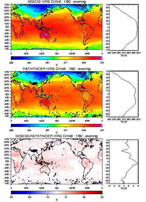
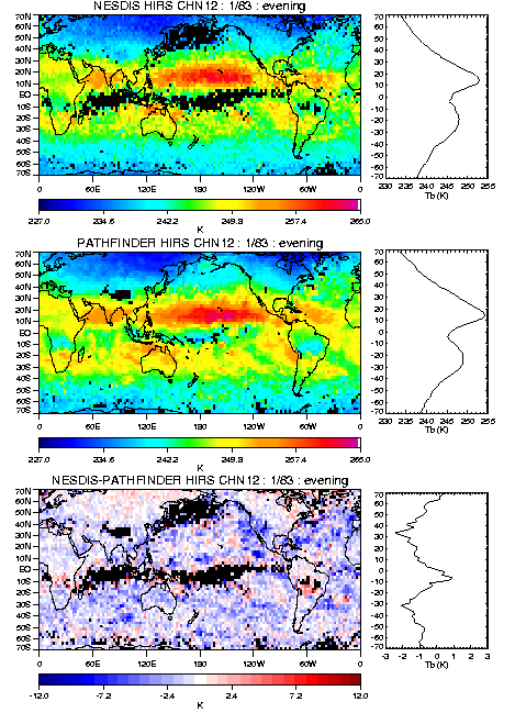
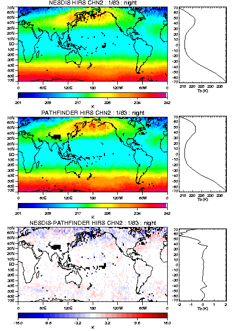
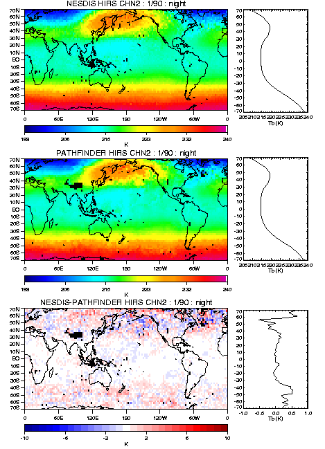
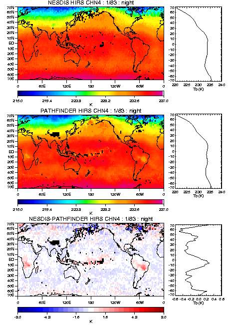
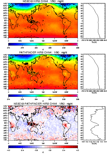
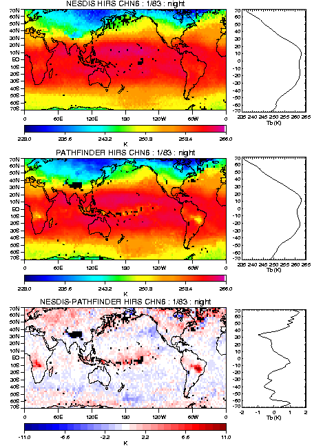
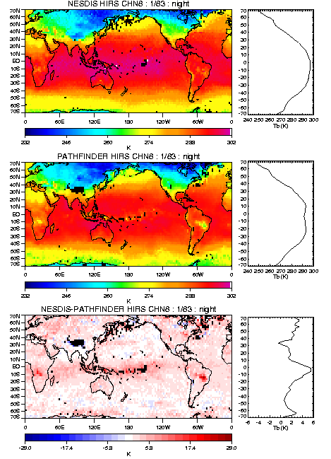
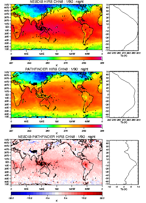
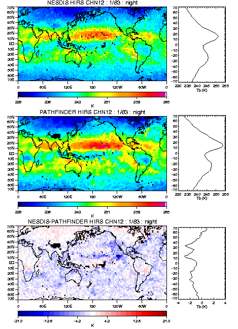
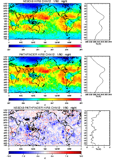
The next set of comparisons look at individual monthly mean
maps. I selected months in the extreme phases of ENSO for this
comparison.
Channel 4 Jan83 Means
Channel 6 Jan83 Means
Channel 12 Jan83 Means
Channel 4 Jul89 Means
Channel 6 Jul89 Means
Channel 12 Jul89 Means
The next set of comparisons look at individual monthly anomaly
maps. I selected the same months in the extreme phases of ENSO
as above
Channel 4 Jan83 Anomalies
Channel 6 Jan83 Anomalies
Channel 12 Jan83 Anomalies
Channel 4 Jul89 Anomalies
Channel 6 Jul89 Anomalies
Channel 12 Jul89 Anomalies
Comparison of the latitudinal band averages for each data set
are presented here. Latitude band averages are compared for
channels 4,6, and 12. The smoothed curve is a 13-month running
mean and the dashed line gives the trend. The zero line
indicates zero anomaly.
NESDIS Chan 4 Zonal
PATHFINDER Chan 4
Zonal Time Series
NESDIS Chan 6 Zonal Time Series
PATHFINDER Chan 6
Zonal Time Series
NESDIS Chan 12
Zonal Time Series
PATHFINDER Chan 12
Zonal Time Series
A more direct comparison of the time series shown above is
given. Only the 13-month running time series are shown for
comparison. The solid curve is the Pathfinder result and the
dashed curve is the NESDIS result. The dotted line indicates
zero anomaly.
NESDIS/PATH
Chan 4 Zonal anomaly Time Series
NESDIS/PATH Chan 6
Zonal anomaly Time Series
NESDIS/PATH
Chan 12 Zonal anomaly Time Series
Here are the results for the same time period but showing the
monthly mean data. No smoothing has been applied here. Solid
curve indicates the Pathfinder results; dotted curve is the NESDIS
results. These results show the Pathfinder data to be warmer for
all three channels particularly for channel 12 where the bias is
larger than intra- and interannual variability. Channel 4 shows
the best agreement between the two data sets.
NESDIS/PATH
Chan 4 Zonal mean Time Series
NESDIS/PATH Chan 6
Zonal mean Time Series
NESDIS/PATH Chan 12 Zonal mean Time Series
EOF analysis for the 30N-30S interannual anomaly data
indicates good agreement for the first and second modes of the
HIRS chn 12 data. Channel 12 agree very well for both the
spatial pattern and the amplitude of the time series. The first
mode of variability for this channel gives the ENSO signal and
explains about 10% of the variance for both data sets. The
temperature channels 4 and 6 show less agreement between the two
data sets. Both channels show differences in the Indonesian
regions where I suspect the Pathfinder data has more cloud
contamination. Both modes of channel 4 highlight this region as
its major difference. Channel 6 has larger differences in both
the spatial pattern and time series. The pathfinder data
indicates a spatial pattern that is dominated by variance over
the Indonesian region. The NESDIS data looks more like its
channel 4 counterpart. The large explained variance for the
first mode of channel 4 is likely related to the significant
decrease in channel 4 brightness temperatures globally for the
period 1983-1986. Time series of channel 4 shown above indicate
a significant decrease in channel 4 observations in both data
sets during this period. This is likely an artificial satellite
dependent bias that eluded the EDF adjustment process.
CHANNEL 4 EOF1
CHANNEL 6 EOF1
CHANNEL 12 EOF1
CHANNEL 4 EOF2
CHANNEL 6 EOF2
CHANNEL 12 EOF2
A comparison of the HIRS channel 6 trend maps with MSU
T2 and T2lt Version D indicates mixed results. Comparisons with both
HIRS 6 data from the NESDIS sounding data and the Pathfinder
data indicate significant differences over Indonesia and
Northern Africa. MSU tends to show more warming in the tropics
(30N-30s) compared to HIRS 6. The differences between T2 and
T2lt are evident over the tropics where the 2lt product shows
less overall warming from 30N-30S and much more warming over the
midlatitudes of the northern hemisphere.
HIRS6 NESDIS versus HIRS6 Pathfinder
MSU T2 versus HIRS6 NESDIS
MSU T2 versus HIRS6 Pathfinder
MSU T2lt versus HIRS6 NESDIS
MSU T2lt
versus HIRS6 Pathfinder
MSU T2lt
versus MSU T2
Last modified: Wed Mar 20 09:58:57 MST 2002