 button to begin with custom graphing.
Click on the 'View Saved Datasets' button
button to begin with custom graphing.
Click on the 'View Saved Datasets' button  to view a list of your saved datasets.
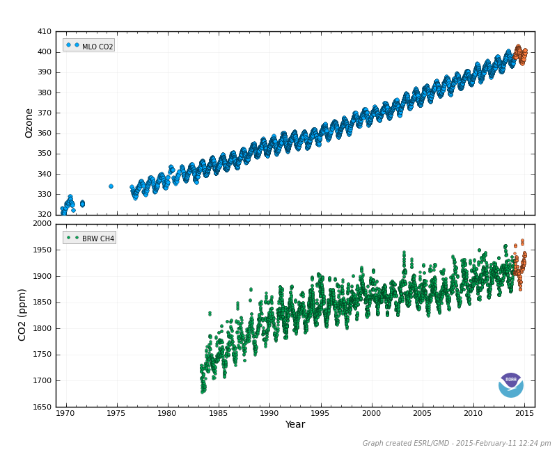
The Custom Plots page is used to create custom graphs from saved datasets. These custom plots can overlay
multiple datasets on one graph frame, and also include multi-panel graphs.
Data sets can be saved from time series plots by clicking the 'Save Dataset' button for
one or more sampling locations. Then click on the
'Custom Plots' button to begin with custom graphing.
Click on the 'View Saved Datasets' button
to view a list of your saved datasets.
Custom plots of saved datasets are currently available only for time series data. This option allows the user to create graphs with a specified X-axis, Y-axis, and data sets in one to six frames.
1. Edit Datasets and their plot attributes
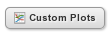
The first section shows a list of the saved datasets. Options in this section are to
remove a dataset from the list, and to modify the plot attributes of a dataset, such as marker symbol and color.
 to remove a dataset from the list.
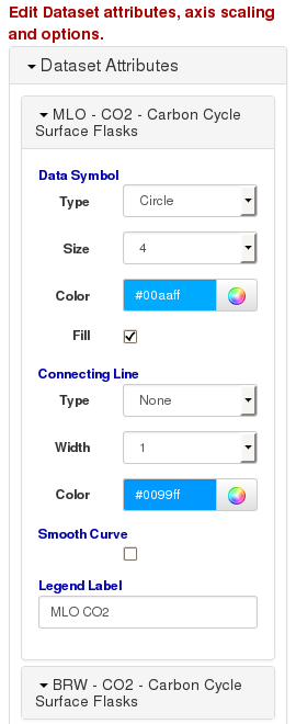
2. Select datasets, Y axis scaling and title for each plot frame
The Y Axis section is used to select which data sets will be shown in a plot frame. Up to 6 plot frames can be
shown on the plot, and any number of datasets can be shown in each frame.
 Figure 2. Select datasets to use for each plot frame, and the Y axis limits.
3. Select X Axis Scaling and Title
The X Axis section is used to set the time range of the frames in the plot.
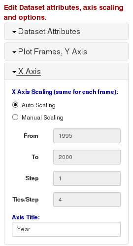 Figure 3. Select the X axis limits. The same limits are applied to every plot frame.
4. Select Options
The Options section is used to set additional options for the plot, such as showing grids and legends, and adjusting
the size and color of the plot page.
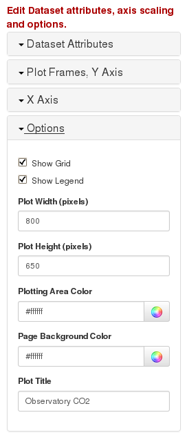 Figure 4. Additional options for the custom plot.
 .
You can also add text to be displayed at the top of the plot for the title.
.
You can also add text to be displayed at the top of the plot for the title.
5. Press 'Submit' button to create your plot.
The last section just has a button for creation of the plot. Once the 'Submit' button is pressed,
the desired plot will be created and shown. This may take several moments to create. A PDF copy of the
custom plot is also made, and can be seen by clicking on the 'PDF Version' link.
 Figure 5. Click on the 'Submit' button to create the custom plot.